Color is one of the significant aspects that affects and attracts visitors to stay in a website. This design aspect may be seen as only a simple part of a site’s “decoration”. But, its purpose is deeper than that. In fact, even the simple process of choosing from various website color schemes to use on a website is complicated. Simply said, the process may look simple. Doing it is even more complicated. In truth, not all are knowledgeable about the significance of color and its proper application when designing a website.
This is not until the Psychology of Colors is applied in the web designing process. Today, this is one of the most reliable concepts that web designers are using to create proper yet elegant website color schemes. They are making an effort of mastering and creating effective and attractive websites based on . But, what it is truly about?
The Psychology Colors
Did you know that gender affects the color preference of people? Hence, the most important things you need to keep in mind regarding the Psychology of Color and its application on website designing are:
- Men like the colors black, blue, green and red based website color schemes.
- Men do not like the colors brown, orange, purple and yellow
- Women likes the colors blue, green, purple and red
- Women do not like the brown, grey, orange and yellow.
Tints and Shaded
Creating coherent website color schemes requires using tints and shades beside the primary colors. tints and shades creates a good sense of harmony when used adequately. Also for user experience using tints and shades gives a good priorities and order for various website elements.
When it comes to shades and tints, women like tints better while men prefer shades. Women also like soft colors while men like bright colors.
Colors, Its Meaning and when it should be used
Red
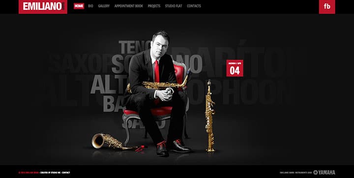
Red is an exciting and stimulating color associated to power and passion. But, it is also associated to violence and anger. Even when often used on warning signs to tell about danger, it is also recognized as a color for boldness and determination. Red when used in web designing proves to be powerful. Otherwise, it may simply deliver an overwhelming effect, particularly when the color used is bright red. Red-based website color schemes used when you need to urge the site visitor to take a fast buying decision and commonly used with promotions and sale products.
Yellow
Yellow is seen as the most energizing color in the color wheel. Yellow is associated to happiness and warmth. When applied in web designing, this color is often used for sites that targets children and youth. That’s because it easily attracts their attention. However, this color should also be used carefully, especially when designing clients from other countries. Be aware that yellow means mourning in Burma and Egypt. In Hindu cultures, yellow is used to in celebrating the spring festival.

Blue
Blue is said to be the most common element in people’s lives considering that the sky and sea are of the same color. It signifies responsibility and calmness. Blue is often used by websites that wants to transmit its solid reliability, trust and integrity and peacefulness. What’s why blue is widely used in corporations and banks websites, Also it’s widely used in marketing and branding website color schemes as it refers to blue ocean strategy.

Green
Green is a color nature, it communicates positivity and gives people the feeling of optimism and calmness. But, it can also mean jealousy or envy. For website application, green is best used for sites that are related to wealth, stability, outdoor services and activities and environment friendly products.

Orange
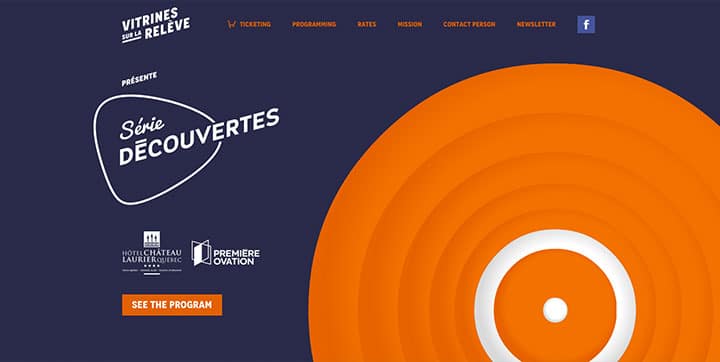
Orange is a vibrant and energetic color. As compared to red, orange is less overwhelming and more balanced that makes it an inviting and friendly color. Both highway workers and hunters are using the color to attract attention. Orange can be used for similar purpose in web design as Orange stimulates buying and subscribing decisions. Orange is commonly paired with blue as both together create seance of balance. Read more about Applying Color Theory on website color schemes and also generating website color schemes for more info
Purple
Nobility and wealth are some of the most common meanings associated to it. It also signifies imagination and creativity. Purple is elegantly used for Beauty and anti-aging products’ website also for exclusive and elite service websites targeting women.

The Importance of Natural Colors
Neutral colors are Black, White and Gray – they are necessary to be used along with bright colors to deliver better impact. While bring colors should be used as a website color schemes primary color for Headings and call to actions the natural colors should be used for background to add seance of space and freedom. However that doesn’t mean natural colors cannot be used for call-to-actions and attractive headers, For example black can be a very good choice when it comes to luxury products and accessories. While also becomes so attractive and eye-catching when used also for headers and call-to-actions on dark website color schemes.
The Last Tip: Consistency Matters!
Using a consistent color scheme across all your marketing and promotional materialsand tools including your website for sure is crucial for branding consistency as it makes it easier for your customers and potential customers to recognize your brand easily, so make sure that website color schemes you are using to build business sites are always inspired by their corporate identities color schemes.
In Conclusion…
When it comes to create website color schemes there is no good or bad color, There is a color used appropriately and a color used inappropriately. Before you start brainstorming for the next website color scheme think first what is your product or service about and who is your target audience. Thats why choosing the proper colors for your website should not left to graphic or user interface designer, It’s mainly the marketers’ job then comes graphics/UI designer job follow marketer’s guidelines and generate proper website color scheme accordingly.
In a future blog post we will discuss the best approaches and tools you can use to generate awesome website color schemes.

